Proving that modern and minimal doesn't have to mean unhomely, I couldn't wait to share these pictures inside new development, Tipi, in Wembley Park, London. Each of the shared spaces and apartments is stuffed with some serious design inspo – as well as lots of easy ideas you can try in your own home. Here are some of my favourites, but leave a comment to let me know what you think too!
Recessed display areas
We all like to have the things we love on show, whether it's books, photos or our favourite objects, but too much shelving can make a room feel cluttered. Here it's been recessed into the wall, not only creating a neat finish but also the opportunity to add some concealed lighting – a fuss-free way to draw attention to what's on display.
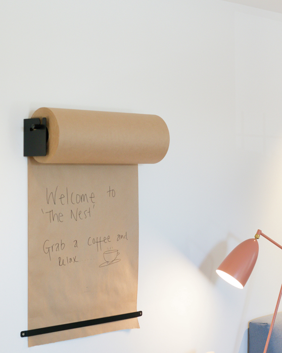
Wall-mounted memos
Whiteboards can get grubby over time, while chalkboards have a tendency to become separated from their chalk. If you're a serial note maker, try this neat idea – just mount a roll of inexpensive paper on the wall, secure it at the bottom and scribble shopping lists, reminders and ideas to your heart's content.
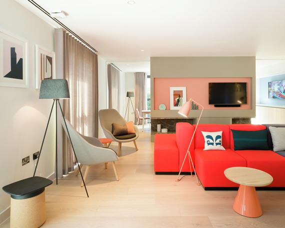
Be a shade braver
Colour often has more impact when it's used sparingly. If you've previously steered clear of bright shades, why not try experimenting with a chair or sofa in an eye-catching colour to bring a room to life? Soft furniture can be easily reupholstered if you ever fancy a change.
Rethink patterns
There's still a trend for geometrics but it's time to give it a fresh, new spin. Instead of carrying them across a whole expanse of wall or floor, why not use a small sample to turn a plain wall into one with more character? An easy way to dip a toe into a bold look, you can try this with tiles or paint.
Hanging decorations
Quirky touches are what turn a house into a home, so don't be afraid to express your personality. Hallway or coatracks are often unloved areas of the home, so try adding an extra layer of decoration. This hot air balloon has been hung from the ceiling in a corner to brighten up a pair of coathooks.
Floor-to-ceiling shelving
Open-plan schemes look spacious and striking but once you've taken away walls, you're left with the issue of where to put everything that needs to go on a wall. A smart way of visually dividing a large room and reintroducing a vertical surface, open shelving combined with a reduced-height stud wall is the perfect answer. Not only does it subtly split the space while maintaining the light, it can also be used to disguise leftovers from a conversion or extension, such as supporting columns.
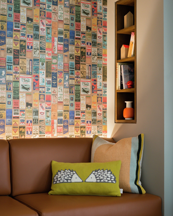
Retro wallpaper
Think beyond florals and bright colours if you're planning a feature wall. As well as faux brick wall and bookshelf patterns, there's some exciting prints that are great for setting a mood in any area of your home. Try this Nightspot wallpaper by Linwood, for example, featuring vintage matchbook covers and just right for emphasising a mid-century modern vibe.
Photos courtesy of Tipi, show homes and apartments designed by David Philips and shared spaces by Manser.
Inspired?
The post Design ideas: contemporary apartments in London
appeared first on Rated People Blog.


Walang komento:
Mag-post ng isang Komento