
Backsplashes have graduated from part of the countertop to their own glorious entity. There are so many options! As I've been looking for my own backsplash, I have been cycling through the yin and yang options–wonderful, delicate feminine yin and bold masculine yang. It's hard to decide which one I like more.

Photo Source: Sharing Stories of Design by Sarah Sherman Samuel
I love the soft, cloudy lines in this marble backsplash and the uninterrupted feel. I wonder if I installed oversized tiles with matching grout if I could get the same look DIY? What do you think?
Get this look
White and Tan Marble Porcelain Tile | White and Tan Marble Porcelain Tile
(Spring Sale till April 8)
 Photo Source: Grain Designers
This Carrera Stone herringbone pattern give the same impressionist softness. It's kind of the perfect meeting of understated color, structure, and movement.
Get this look
Mosaic Herringbone Tile
(Spring Sale till April 8)

Photo Source: Palmer Weiss
This subway carrera is also lovely, refined and classic. It makes me feel like the Venus de Milo will be coming over for brunch.
Get this look
Subway Carrera
 Photo Source: Home Bunch
With slightly more color and more contrast, you can still enjoy a classic Greek sculpture look. Note how the designer combined the darker gray mottled subways with the lighter marbled countertop. I am loving the combination–one with the flowing swirls of marble and the other with the ordered lines of subway tile, and both with undulating color.
 Photo Source: Just a Girl and Her Blog
I don't know why it is but hexies make me happy, even in soft colors and classic stone! Why is that? Add an accent color like this turquoise and I just feel fabulous! Bright white grout ties into the cabinets and frames the hexagons.
Get this look
Hexagon Backsplash Tiles
(Spring Sale till April 8)

Photo Source: The House Diaries
Even without the accent color, the hexies add a subtle excitement. If you love restraint in design, hexies are the perfect ever so subtle secret wink to your hidden mischief.
Get this look
Hexagon Backsplash Tiles
(Spring Sale till April 8)

Photo Source: Traditional Kitchen by Lititz Kitchen & Bath Remodelers Kitchens by Eileen via Houzz
Basketweave backsplash in a white kitchen with chrome appliances and both dark and light countertops! Nirvana! I love the woven pattern of the basketweave. It's light, but it's dark. It's calm, but its unique. Love!
Get this look
Basketweave Tiles
(Spring Sale till April 8)

Photo Source: Better Homes and Gardens
Now I'm standing on the balance of Yin and Yang. Bright white cabinets, not a lot of contrast, lots of reflected light, but also cosmopolitan stainless steel. This clever mix of materials, incorporating the chrome appliances into the decor with a few well placed steel tiles and the backsplash behind the stove, raise a simple subway to the next level. And BONUS! Looks like easy clean up to me!
 Photo Source: HGTV
Metal subways and dark cabinets present an industrial feel. Lustrous tiles give a modern flair to a retro tile. Note the stripe of dark tiles on the right side of the backsplash. The burnished asymetric dark stripe provides an unexpected detail, softening the impact of the entire wall of steel. The round dishes on the shelves also balance the yang.
Get this look
Stainless Steel Mosaic Tiles | Stainless Steel Brick Tiles

Photo Source: Beeyoutifull Life Image by Nicholas Design Collaborative
This modern kitchen makes my wheels spin! I have been scoping out all sorts of stainless steel tiles and so many of them would be amazing in an application like this! If your kitchen opens up into a great room, consider creating a focal spot of stainless steel tiles. The kitchen-ness of the room is toned down by the strong architectural lines of the stainless steel. I love that the rest of the backsplash disappears into the walls, so the stove-splash can shine.
This is such a flexible idea! Whatever you love could really make a statement without swallowing the whole kitchen. Remember to consider how much sheen you want. Amazing!
Get this look
Modern Trapezoid Stainless Tiles | Cobblestone Stainless Tiles | Random Liner Brick Stainless Tiles

Photo Source: HGTV
I love these large wood-look tiles. Vertical lines in the installation and horizontal lines in the wood look modern and so yang! This picture just says Manhattan to me. I found a source of even larger tiles in several wood patterns and colors that seemed like they would be amazing too.
Get this look
Wood Grain Tiles
(Spring Sale till April 8)

Photo Source: Apartment 34
This kitchen presents a glimpse of a lighter version of kitchen above–smaller tiles but woody. Again, modern, minimalist! I can almost feel sea air and warm breezes just looking at this picture. It looks like they used actual wood, but I also like the idea of the easier clean-up and longevity of woody tiles.
 Photo Source: Home Design Ideas
I guess I've found a theme I didn't know i liked: vertical installation of long narrow tiles. Such a strong and bold look. That grout looks metallic, matching the sink and fixtures. Is it inset metal strips? Who knew that would be such an effective way to tie the kitchen together!
 Photo Source: Eden Mosaic Tiles
Check out this commercial lunch kitchen look. It just sparkles with clean, slick and chic. Although the backsplash is black, the effect is much lighter because of the reflected light. Consider the different effects of natural light and artificial light on this color when you are planning so you get the results you want. You could also try a black and silver mix.
Get this look
Thin Metal Backsplash Tiles | Black Stainless Tiles
Thanks for taking my tour with me! Thanks to Build Direct, Eden Mosaic Tiles, and stainlesssteelbacksplash.com for hosting this post and making our lives more beautiful!
Fyi–BuildDirect is hosting their Spring Sale and most of the BuildDirect tiles showcased above are on sale–not to mention a thousand other amazing remodeling and furnishing desirables! You can check them out here: www.builddirect.com
The post 14 Neutral Backsplashes: My Monochromatic Tour of Yin and Yang appeared first on Remodelaholic.
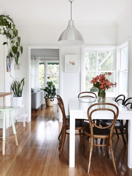 The Design Files As I mentioned this week, it's pretty fun to pull my furniture around and start to “live” with the rooms arranged closer to what I envision. But at the same time, it's a bit frustrating to have to wait to really see everything I imagine! I don't want to be patient, ha, I'm […]


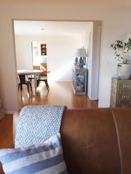 When I last was brainstorming on the blog about our kitchen and dining room, and what the main floor plan might feel like, basically the conclusion was to leave the kitchen in the kitchen and keep the dining room as a dining room, rather than swapping the two rooms (BRILLIANT IDEA, right?). With all my brainstorming and planning, I've […]


