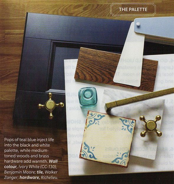
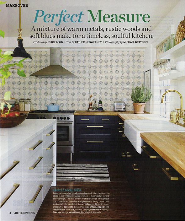
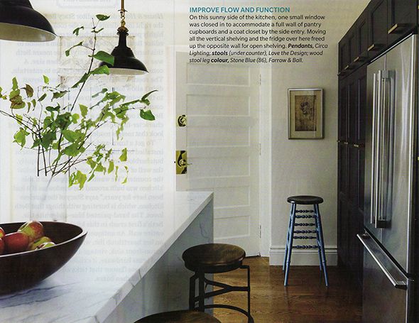
A few dozen magazines later, I got to my February 2012 House and Home issue and rediscovered this kitchen, an old favorite for sure. Remember this spread? It's everything I'm hoping to achieve with my kitchen update. It's a little bit modern, a little farmhouse, and there's lots of personality thrown in. And for the first time, I realized those cabinets are IKEA! They look SO great here, don't they? That brass hardware from Richelieu is pulling some serious weight!
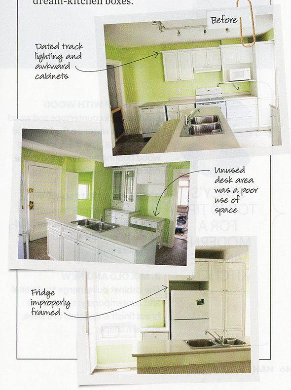
The space looked pretty sad before the renovations. It was outdated and the layout was terrible.
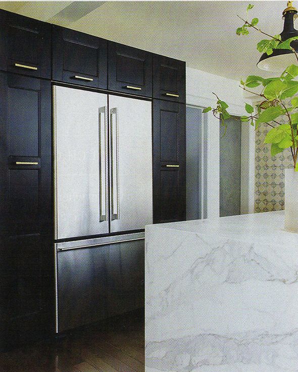
The new layout makes the space look twice as big! It's crazy how expensive this whole space looks. They built out the pantry cabinets a little bit so the (IKEA!) fridge would be flush with the fronts. I also like where they mounted the hardware on the tall side cabinets. And check out that waterfall edge on the island! You know how much I love that look...
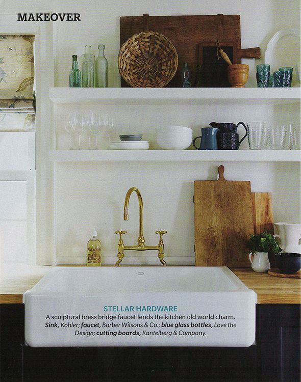
I love how they mixed inexpensive butcher block with the marble. It seems like this mix of low and super high-end was the secret here for the entire space. You might not normally expect to see a Barber Wilsons brass faucet in an IKEA kitchen, but I guess you can afford to spend thousands on faucets and hardware if you are spending only a third the cost of custom cabinetry. It's a great trick - distract the eye with the shiny pretties and no one will notice the IKEA at first glance. And then they won't care when they do figure it out! IKEA cabinets work and look great!
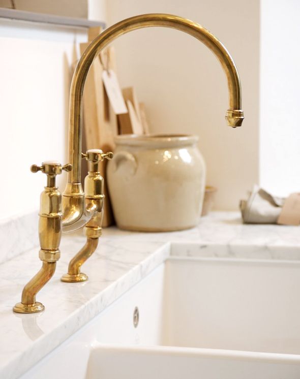
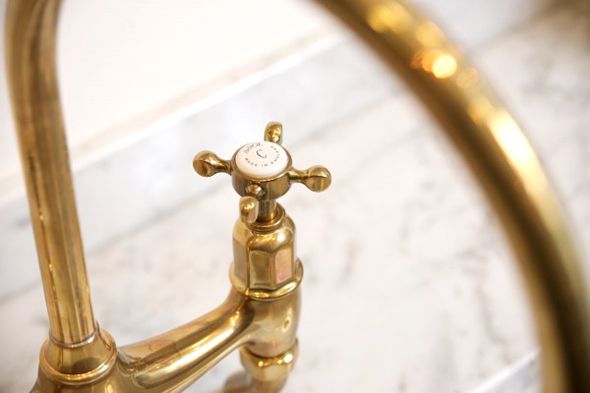
Oh, and speaking of brass faucets, did you see this beauty from DeVol for Perrin and Rowe? Such a great price point and so similar to the much pricier one above.
I feel like the obvious showstopper in this kitchen though is the handpainted backsplash tile. I lurve it.
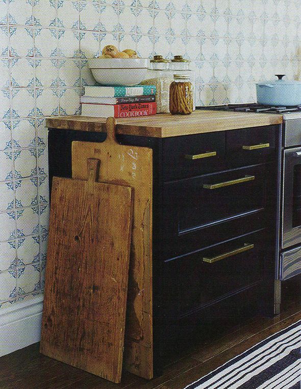
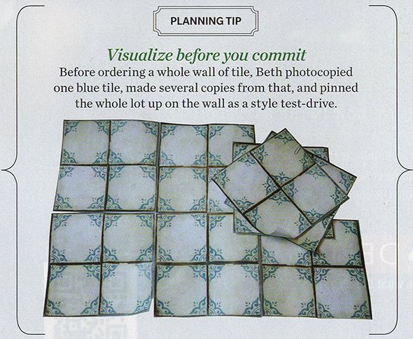
The homeowner scanned in a sample tile and printed out multiple pages of the scan to tape up on her kitchen wall to make sure she could live with and commit to the pattern. Isn't that a GENIUS idea? Just like with wallpaper, it's easy to fall in love with a small sample, but it's really the overall pulled back pattern that you'll actually need to love!
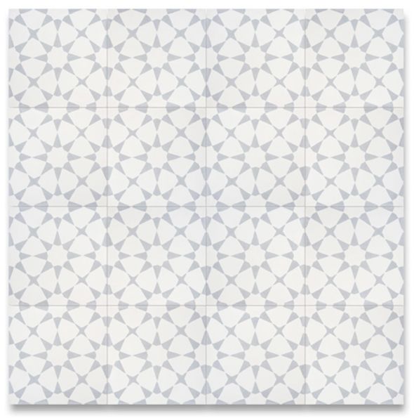
This tile is from Walker Zanger (another high-end purchase). I love it. I think it's a smart move to go with a more restrained pattern. I'm thinking of something like this similar cement tile for my kitchen backsplash maybe and printing out scanned in tiles to tape up on my kitchen wall was just added to my to-do list!
Do you have an all-time favorite kitchen? I have about twenty, but this one is proving to still be an inspiration! Long live print publishing!! :)

images are my scans of House and Home February 2012
Walang komento:
Mag-post ng isang Komento